
Do you have a good website color? Well, a fact is, the color of you website matters! Theres a lot a website can say just by the colors of it. For instance bright and contrasting colors can highlight important elements and/or buttons that call users to action. Color can also shape the way users engage and navigate your website. Color psychology is that study of how colors can affect human emotions and behavior. Understanding this is crucial because it helps designers use colors strategically. The color of a website is more than just something that looks aesthetically pleasing, you can make powerful tools for conveying messages or even making memorial experiences.
Color Meaning
Colors aren’t supposed just appealing, they can and do have the ability to bring out certain emotions. For example-
- Blue: Blue can show calmness and peace, hence why a lot of companies use it. It can also symbolize trust and dependability
- Red: Red can mean many things such as love and energy as well as passion, it can also show urgency and a sense of danger. It also can represent power, excitement or even luxury when used in branding.
- Green: Green can mean many things as well, most commonly it symbolizes nature, safety, and reliability. Growth, wealth, and prosperity also are represented by green.

Each color has unique emotional effects. By learning how various colors can impact users, designers then can use them strategically to make the user feel particular feelings. This enhances user engagement and it also reinforces the brands identity.
Color Trend Predictions of 2024
For 2024, color trends are expected to be heavily inspired or close to natural elements as well as sustainability. A color example of the trend could be something like a rich green similar to lush forests, which establishes a connection with nature. Some other shades can also include warm earthy tones and a few gentle blues.
How colors can contribute to brand identity
While colors affect the users they also can affect the brand identity online and the recognition of this. In today’s competitive world of business, your brand’s recognition is crucial to be successful. Having your website stand out from others is a great way to capture the attention of customers. Color conceptions play an important role in shaping brand perception. By taking control of the power of colors brands and companies can create a strong and memorable image of themselves. But one thing to note when doing this, consistency is key. The importance of consistency in color is very important. By keeping a constant color theme your business can establish a strong online and visual identity that people can easily recognise and associate with.
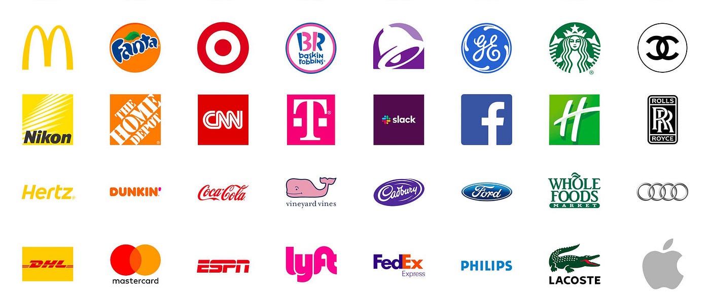
Some popular brands with color recognition-
- Target- Red
- HomeDepot- Orange
- McDonalds- Yellow
- Starbucks- Green
- Pepsi- Blue
- TacoBell- Purple
- Apple- Grey/White
In all, picking your color scheme for your website is important. It might seem like you can choose any color you want but would it make sense to have a website about cute adoptable cats with a bright orange and green color theme? No. You could go for softer colors, like whites, light blues or greens, soft browns or even cream colors. You should take time and think when you choose these colors because those colors are going to be seen by all your customers. I encourage you to take time and put yourself in the users shoes. When you have a website you want people to remember it for and amazing design and beautiful colors, not an eye sore. Capture the users attention and keep it, use the color scheme to your advantage.