For this blog I will be showing the poster work I did for FFA.
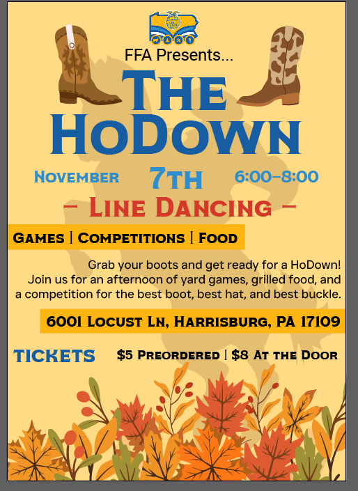
At first, I used a bunch of blue and different colors for the HoDown flyer. I thought it looked cool, but then I realized it didn’t give off a western vibe at all. So, I went back and changed the whole color scheme to something more rustic. I used browns and tans to make it look more like a real western event. The final version was way more on-theme and appealing.
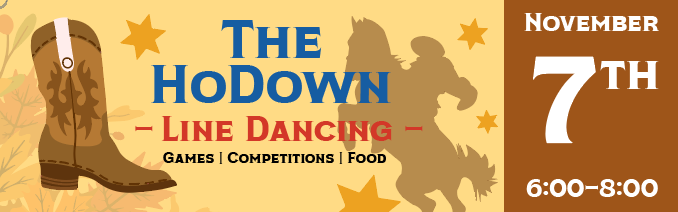
Once I confirmed with them that this is what they wanted, I used parts of the poster to make the tickets!
I also worked on organizing all the information clearly. I made sure the date, time, and all the activities like line dancing and competitions were easy to spot. By fixing the layout and colors, the flyer looked much more put together. It went from looking kinda random to a cool, cohesive design that really fit the party’s theme.